Identity
/
Packaging
/
Illustration
/ About the project
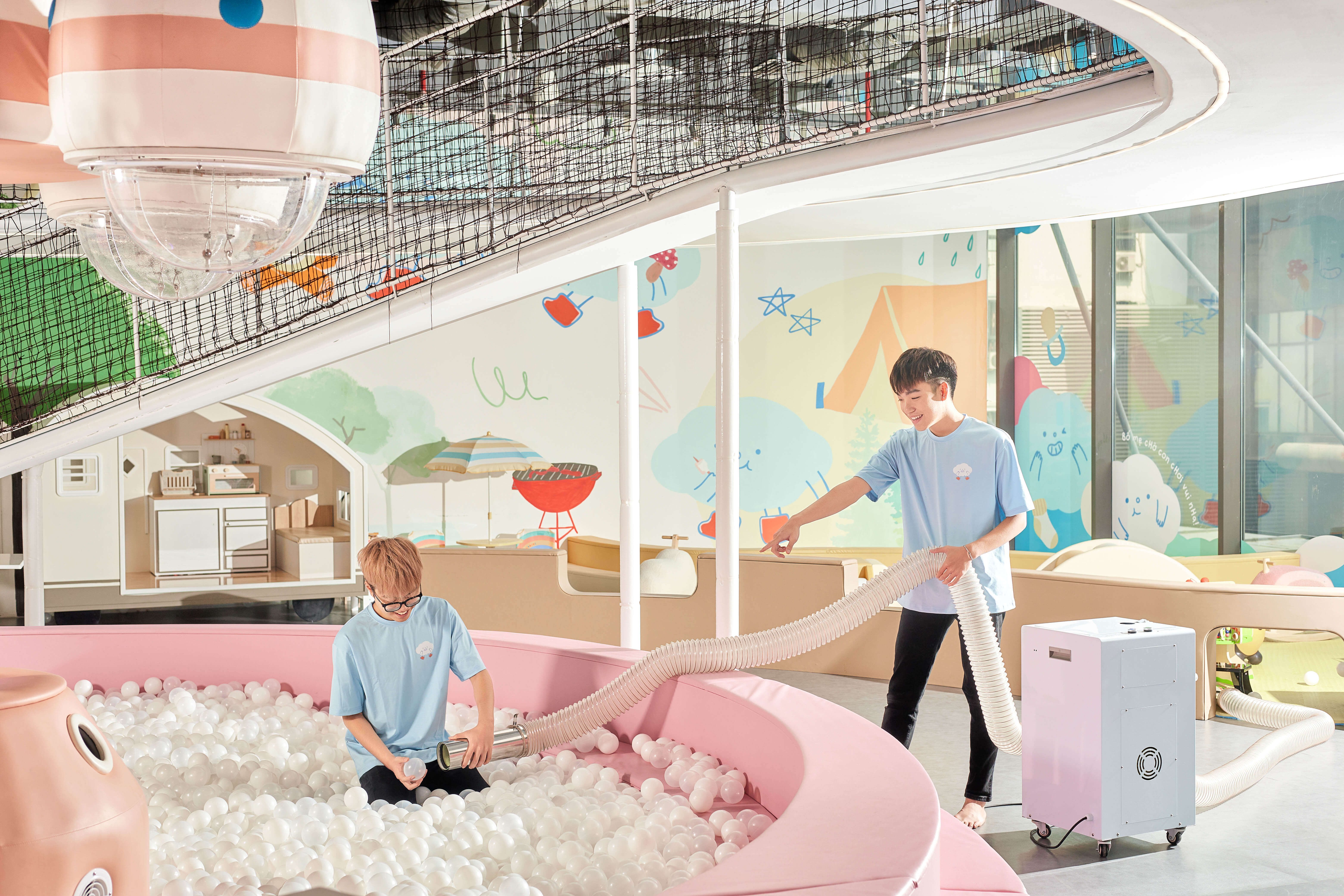
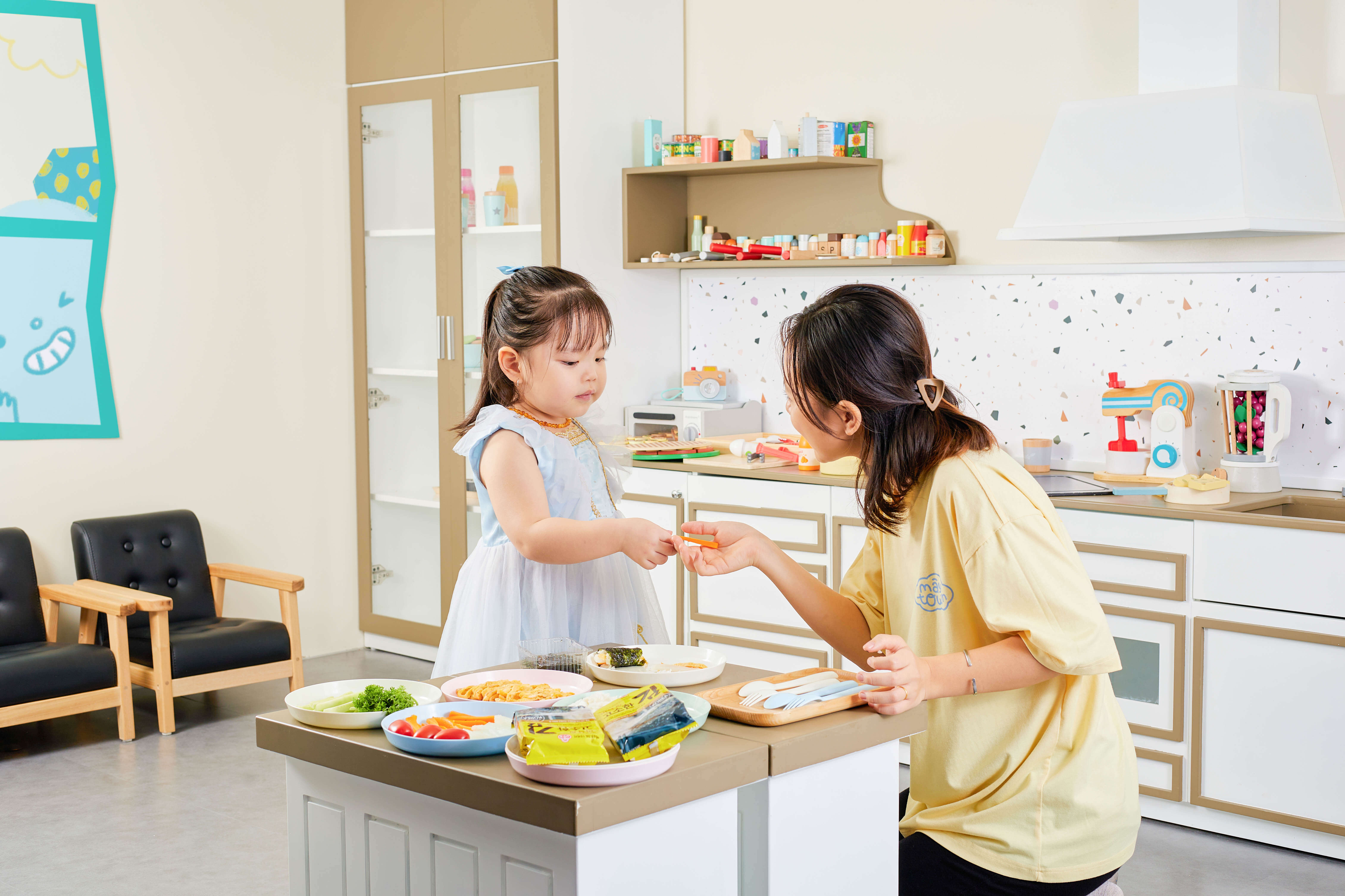
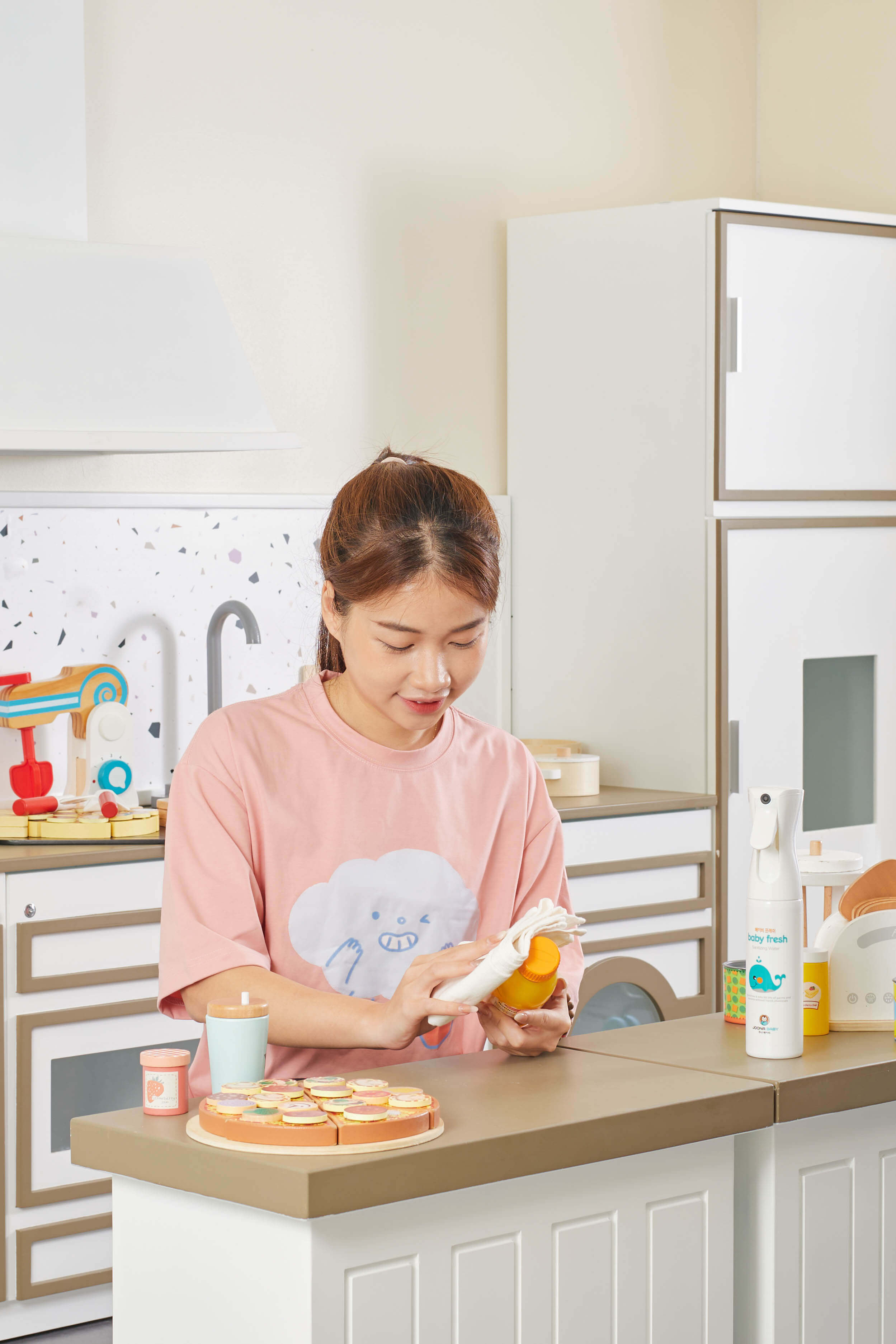
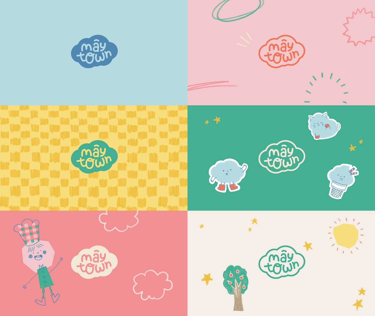
Mâytown is a playground that embraces and nurtures children’s playfulness and limitless creativity. At an age ruled by curiosity and imagination not yet spoiled by the real world, kids are amazing artists with unexpected and out-of-this-world ideas. Keeping that idea in mind, Mâytown was created as a space for children to express themselves freely without fear or judgment. Here, the sky is the limit.
Mâytown values diversity, differences, and uniqueness. The word Mây (meaning cloud in Vietnamese) gives off a soft and protected feeling, highlighting that this is a safe environment for the kids to be creative and imaginative. We carefully researched and worked together to develop a brand language that speaks to the diverse, comfortable, exciting, and playful spirit of Mâytown.
/ Credits
Client: Mâytown Kids Cafe
Creative Director: Hiep H
Production Manager: Colin Tran
Art Director: Madeline Nguyen
Designer: Madeline Nguyen
Project Manager: Chii Nguyen
Showcase photography by Viet Ngo Hoang. Photo courtesy of Cohe Studio & Mâytown.
/ Year
2022
/ design concept
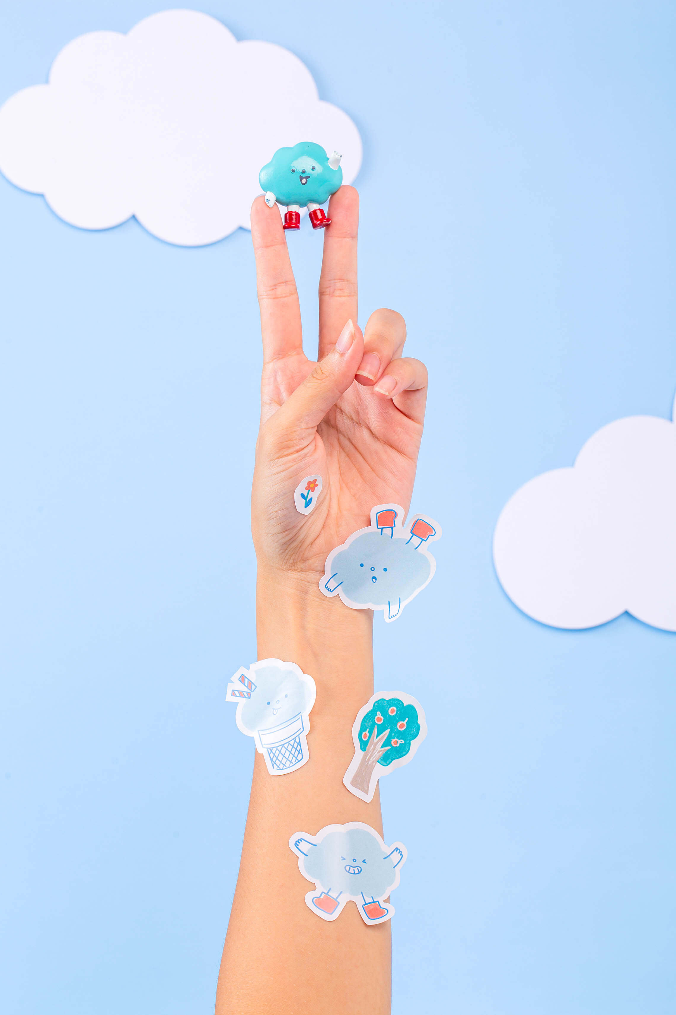
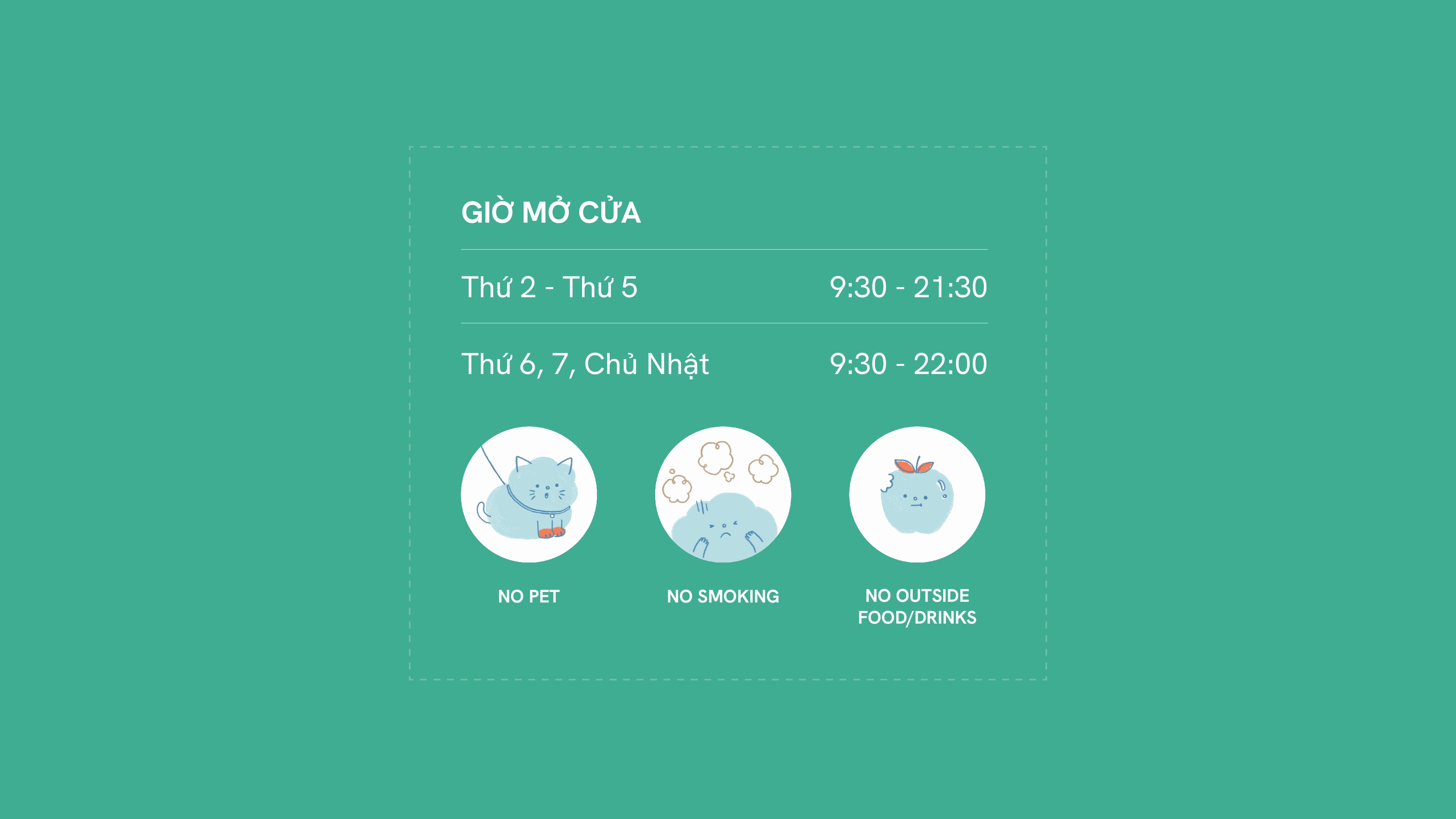
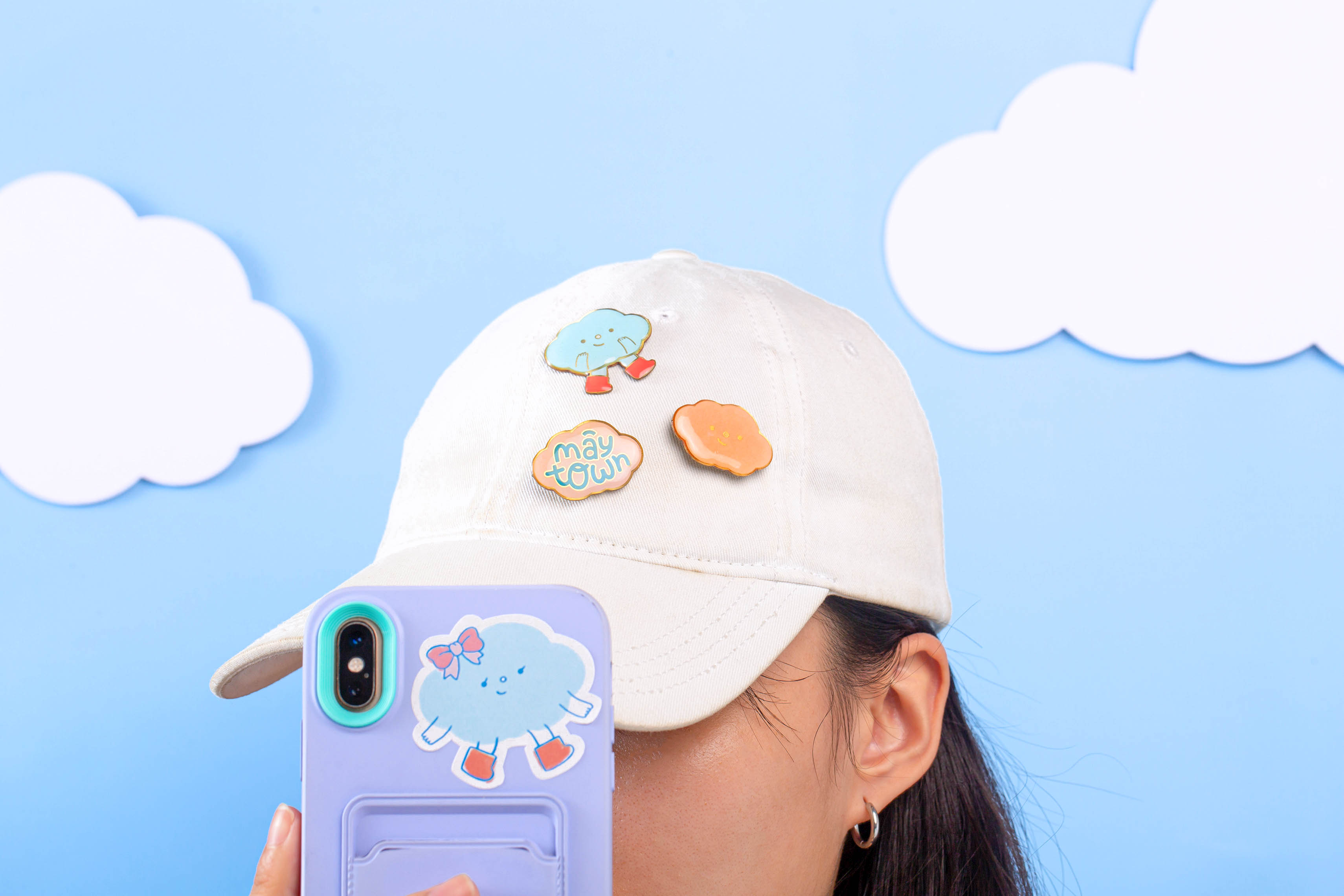
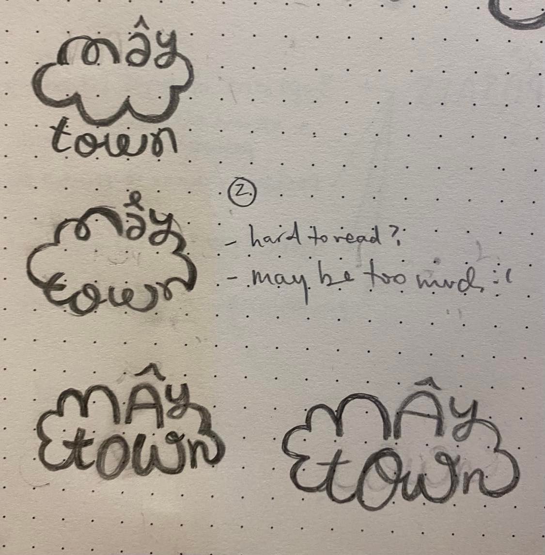
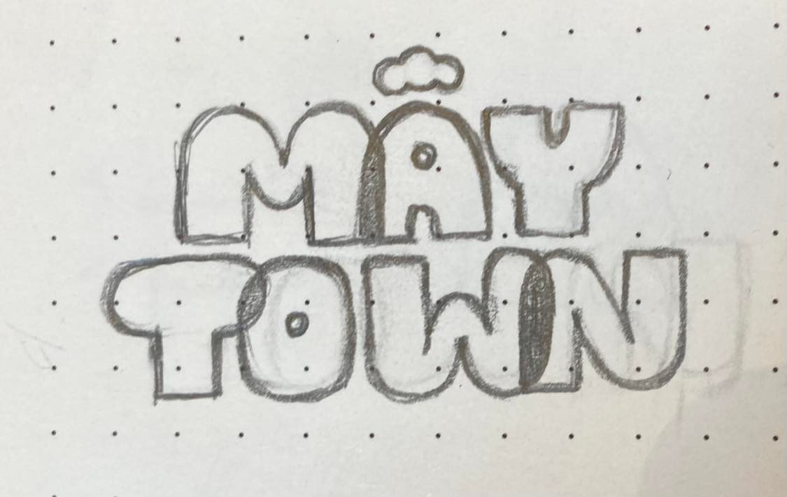
Olah is a curious little cloud friend from the land far away above the sky. After brainstorming ideas based on this story, we came up with a design system including a mascot character, a cloud-shaped logo, and hand-drawn graphic elements with exciting colors that could grab any kid’s attention.
/ applications
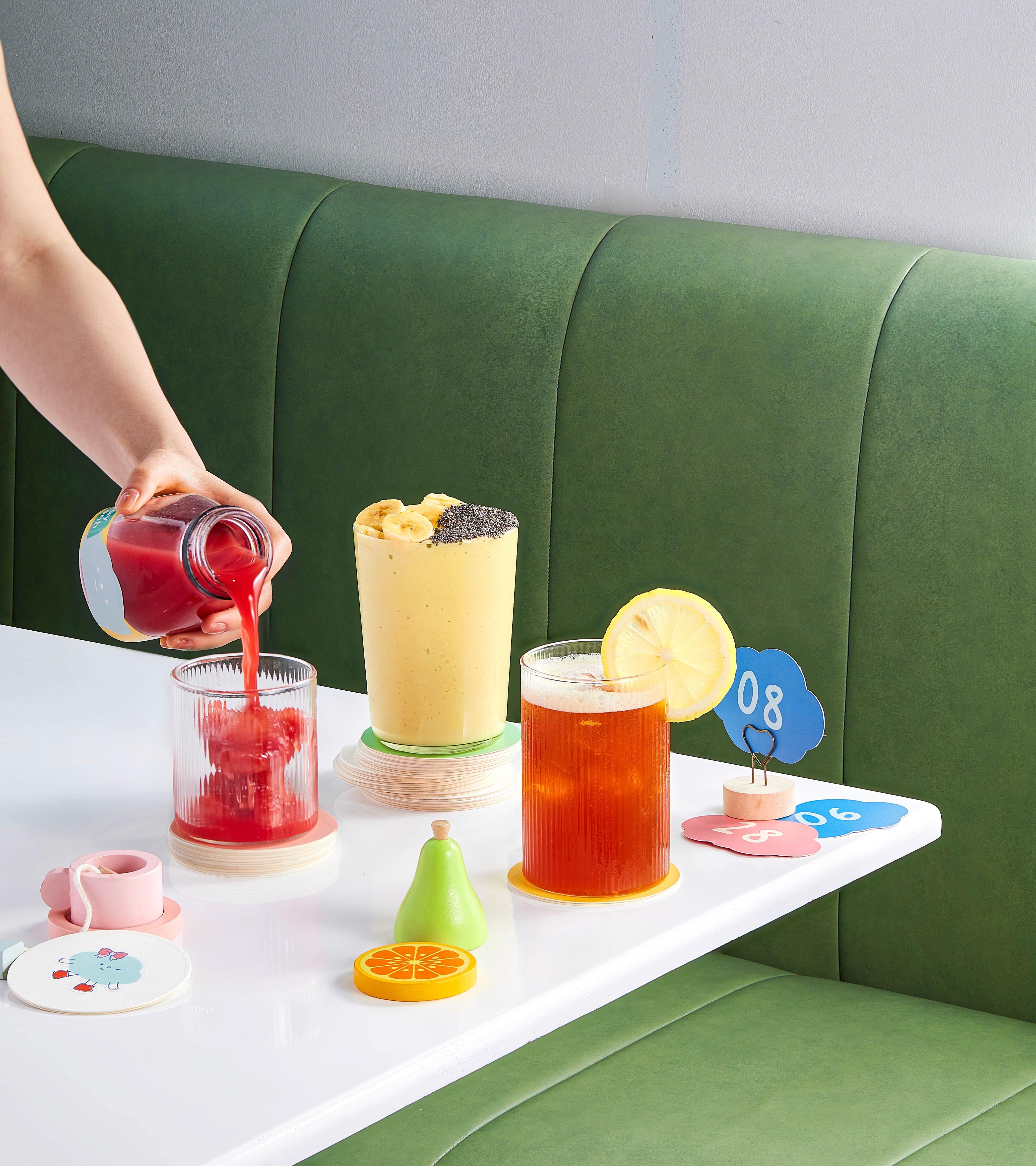
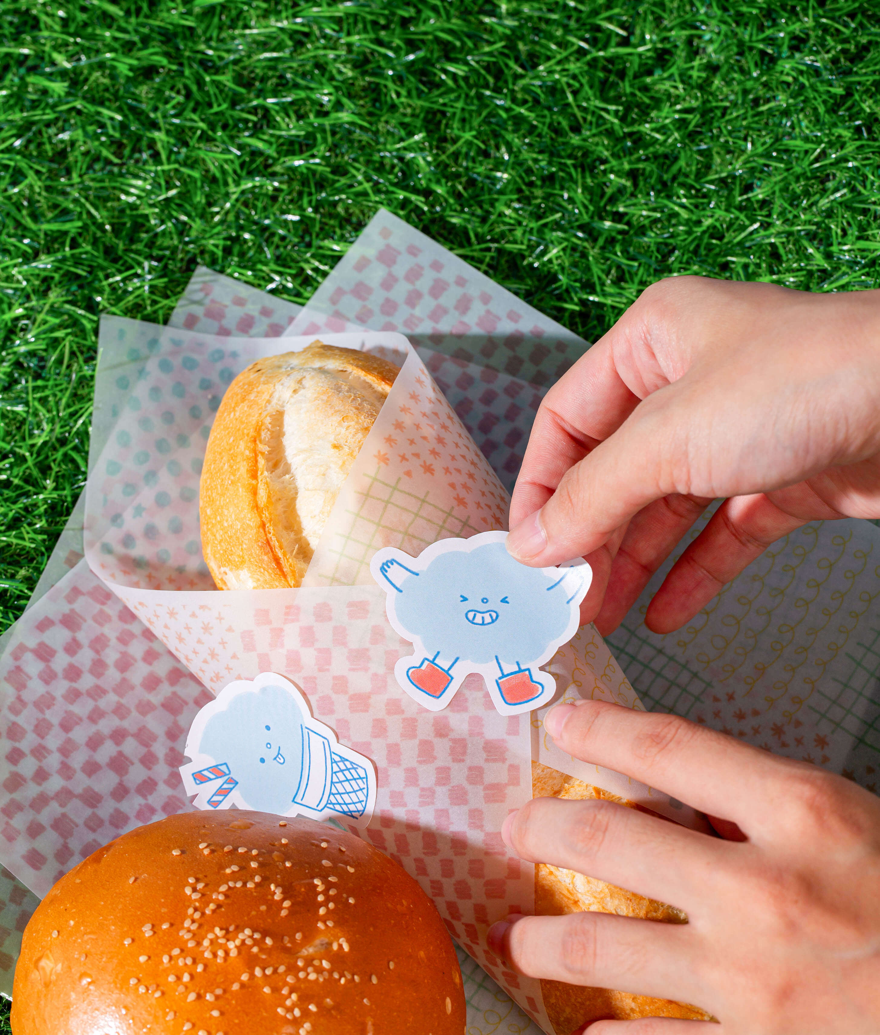
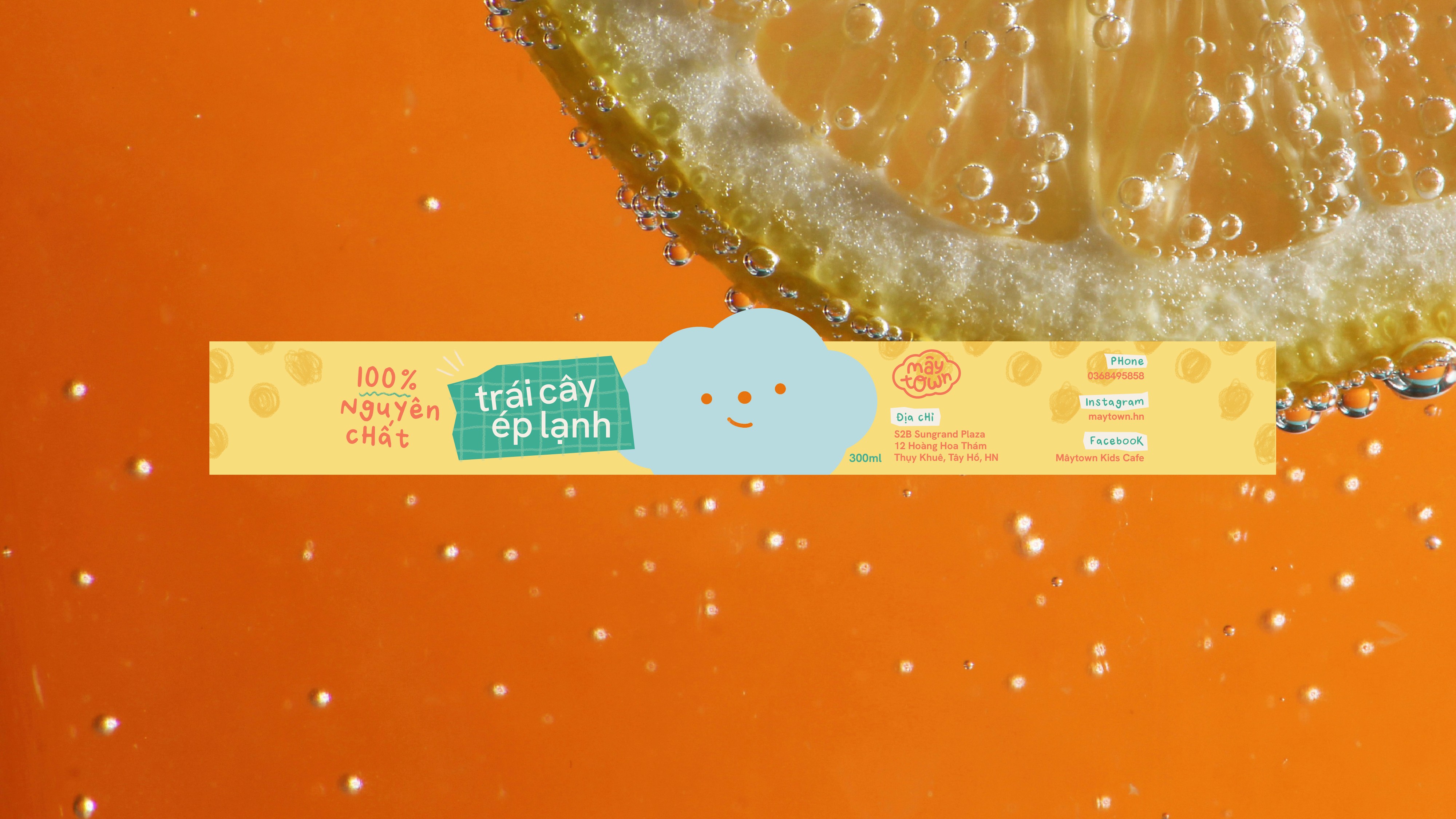
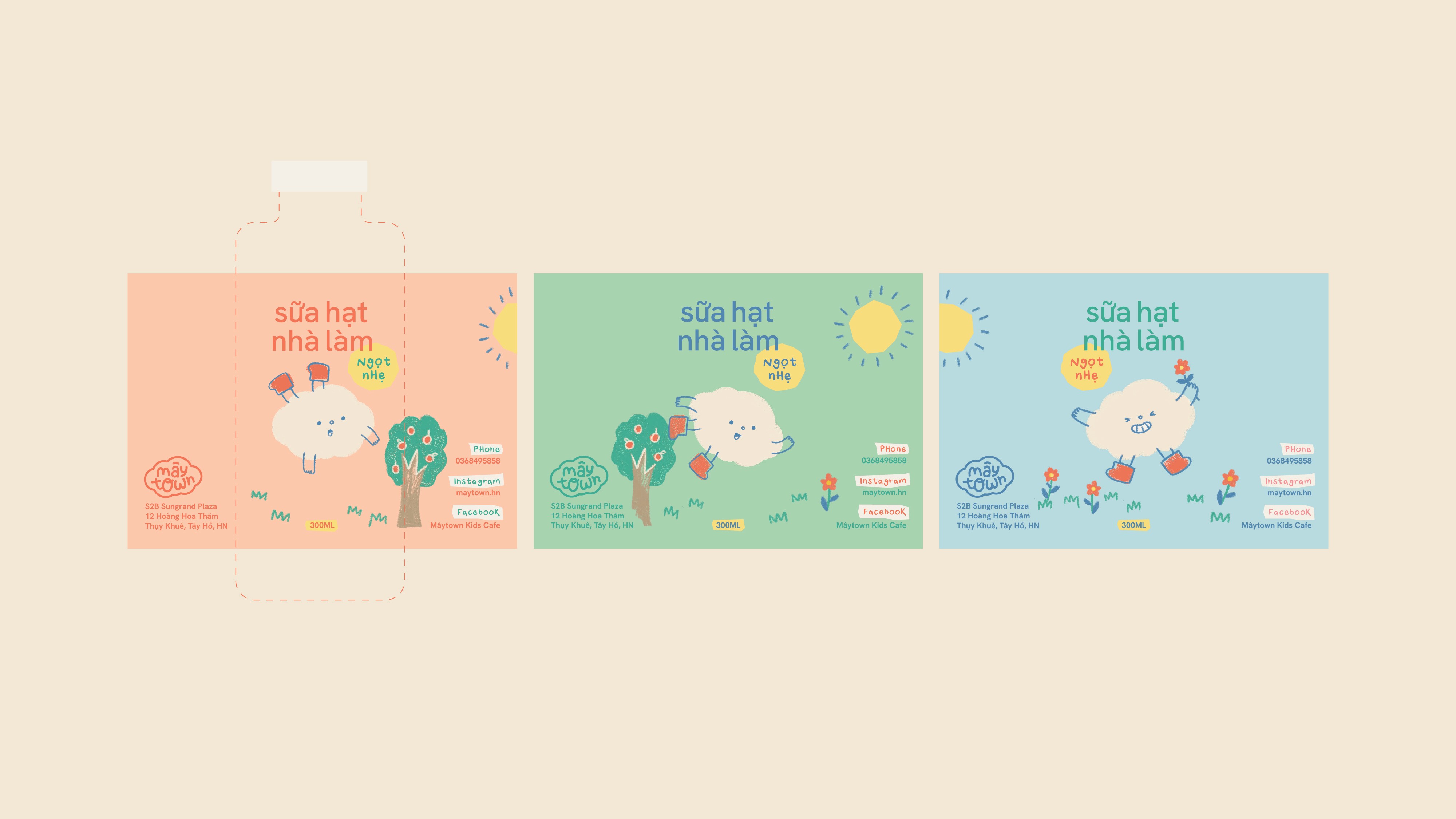
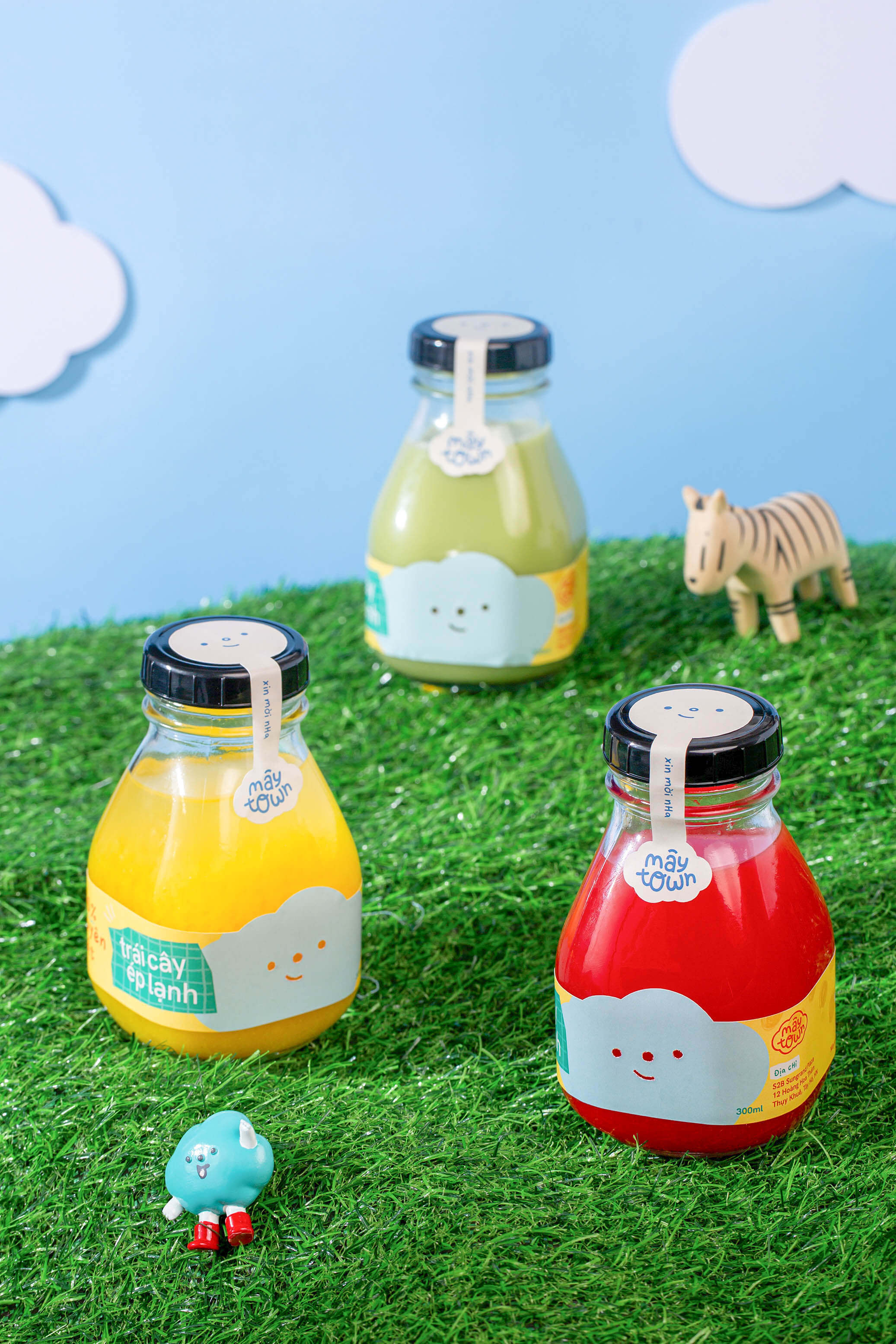
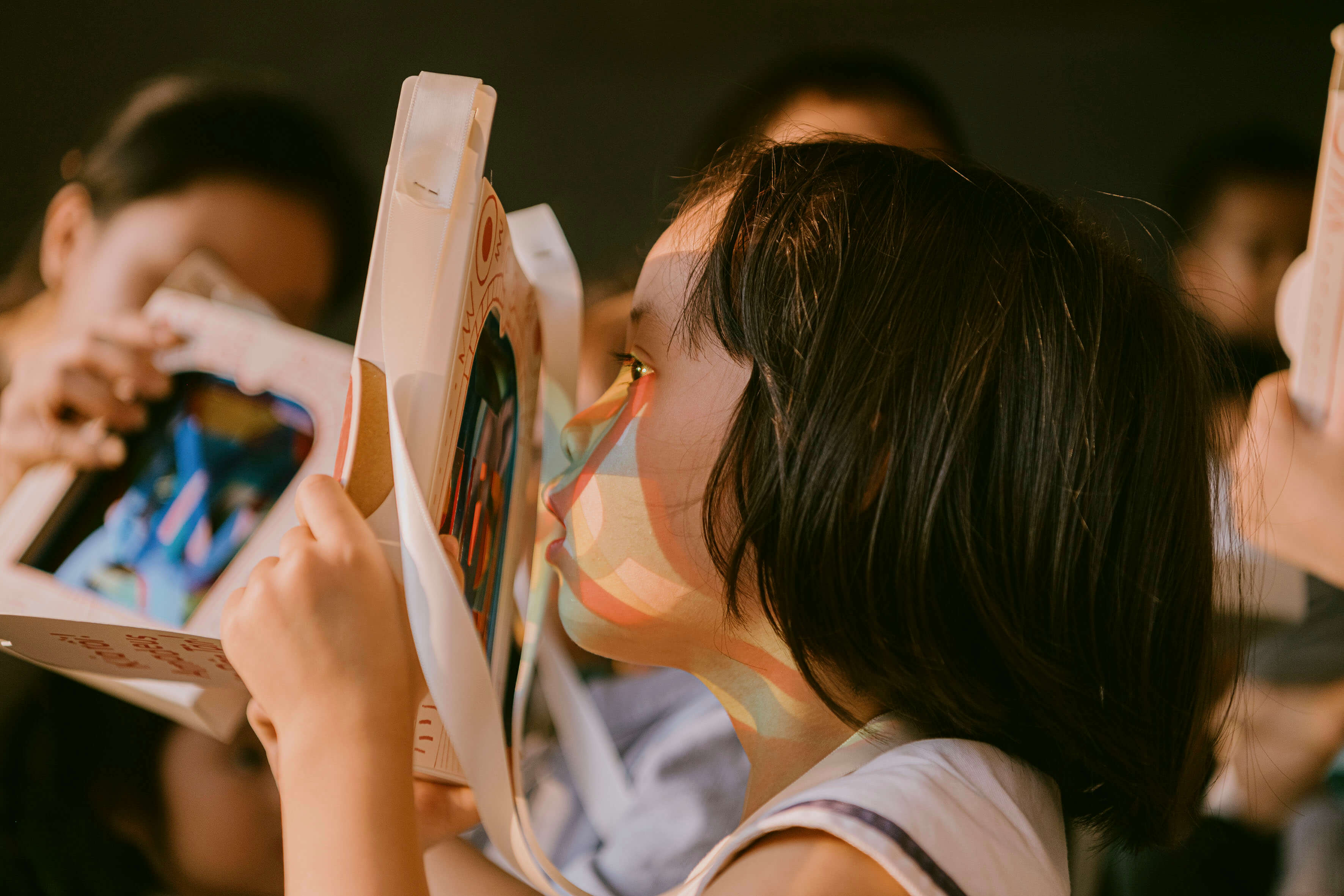
The packaging is designed to interact with the children's imagination and curiosity. Illustration elements and patterns are carefully but free-spiritedly created with a crayon brush and a bit of spontaneity to resemble children’s scribbles. We also play with the typography baselines, occasionally making the letters crooked and more visually interesting.
/ Behind the scenes
Get in touch
